
Maps have always fascinated me. As a kid, I remember scrutinizing Tolkien’s maps of Middle Earth for what seemed like hours, tracing the path to the Lonely Mountain and Mordor. When I made a recent trip to Walden Pond with my creative writing class in April, the only thing I was adamant about purchasing was a copy of Thoreau’s survey of the pond from 1846. I guess it doesn’t matter if they’re fictional or real, but there’s something about maps that I appreciate as a writer. Maybe it’s because maps communicate something that’s so hard to put into words. That sense of direction, distance, depth—those relationships that maps allow us to glean more readily than words.
In the past few months, I’ve been researching Susquehanna County and Montrose, Pennsylvania, where I currently reside. Besides documents and pictures, the old maps tell a story all their own. For example, the Map of Susquehanna Co. from the Actual Survey by G. M. Hopkins, 1858, is a large color map of the county including street layouts of the major towns. The framed copy in the Susquehanna County Historical Society in Montrose is especially ragged, the wear emphasizing its age at over 150 years. Like Tolkien’s maps included with his stories, the hand drawn nature of this map captures my attention, but there’s another thing that’s taken some time to really grasp.
The artist for the Hopkins map rendered the buildings along the streets as tiny dark squares of varying size and shape, labeling many of them with their owners and even plot boundaries. Why does this make any difference? For me, it’s because there’s just enough room in the details for the imagination to do its work. Unlike Google Maps, where the fascination lies in seeing an actual image of your house on the screen, and how many of us haven’t done that, this map leads me to wonder about all those dark boxes, lines, and labels. In the end, the map requires a certain amount of mental work to read the story with the limited details.
That said, this map is even more special because of the vignettes along the margins that provide a glimpse of life back then. For instance, there are four drawings of Montrose, including the newly built Court House, only three years old at the time. There’s also a drawing of a snowstorm on April 21, 1857, that dumped over three feet of snow in Montrose, which must have been quite remarkable to have been commemorated on this map. It’s the only event on the map, as the other vignettes are buildings or landmarks such as the Starrucca Viaduct.
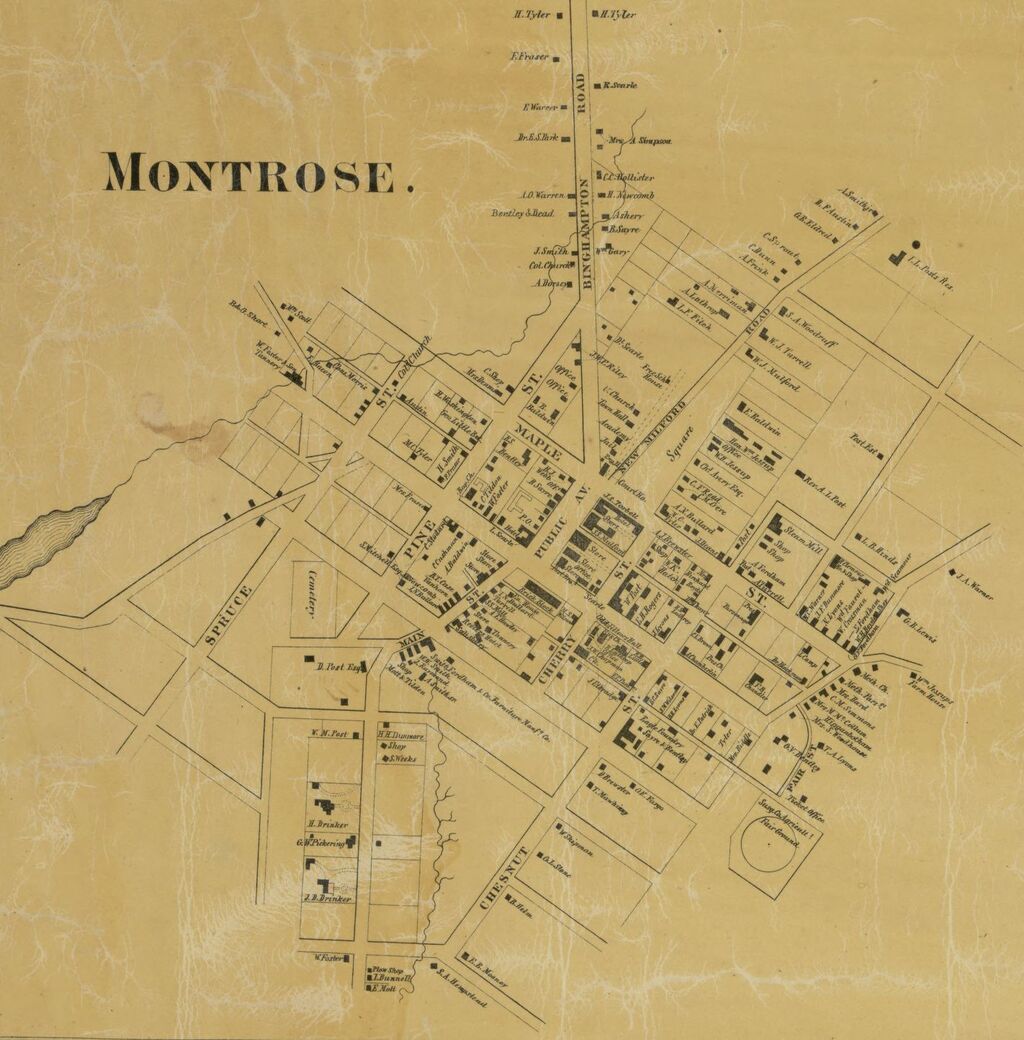
Another large map hanging in the Historical Society is titled Map of the Borough of Montrose, Susquehanna Co. Pennsylvania, Surveyed and Drawn by Philip Nunan. Published in 1853, this map also has vignettes, mostly of residences around town. The streets seem to be the real focus of the map, however, and a careful study reveals some significant changes over time. The original scheme was a grid, which the map readily communicates. But some streets, compared to the present, are almost completely gone. Take Pine Street, for instance, near the county courthouse. Only three houses still remain on this short street that I always thought so awkwardly placed, but the Nunan map shows this street used to run all the way down to Church Street and beyond, and parallel to Spruce, which makes much more sense to me now. Not to mention that two evergreen names were placed side by side, something that never occurred to me until studying the map.
Like Pine, Beech Street also had some major changes, because the Nunan map marks it as a long straight street whereas the street now takes a meandering route through the area just south of Church Street and Tannery Place. In some cases, the streets have even flip-flopped names, as appears to be the case with Chestnut and Cherry. And this is where the maps fall a little short, because they don’t reveal the reason for the changes, but simply record them over the years. I know, for instance, that Montrose suffered some devastating fires, and I’m wondering if some of these changes weren’t made on the heels of these major fires. It’s something to consider when studying the history of the town.
Many people are familiar with the panoramic maps of Thaddeus Mortimer Fowler, who signed them simply T. M. Fowler. These birds-eye maps may be the ultimate treasure in capturing the history of many towns in Pennsylvania at the turn of the century. Each one is a meticulous study of a town, drawn with three dimensional buildings that are remarkable in detail and accuracy. When thinking about the Hopkins map I described earlier, these maps are the antithesis, recording the town with such facsimile that someone can’t be but overcome with awe, and I know that several of my local friends have the map of Montrose from 1890 hanging in their houses. Fowler drew 426 of these, and of those, 248 were towns in Pennsylvania. Until recently, however, I didn’t know that the Library of Congress has these maps available online, and the tools provided at the website allow you to zoom in very close and see the drawings in greater detail than ever before.
Some may also be familiar with the Susquehanna County Atlas of 1872 published by Frederick W. Beers. Unfortunately, the Library of Congress doesn’t have that map available yet, but there are other places online where it can be viewed such as the website Historic Map Works, which provides tools very similar to the Library of Congress. The atlas is beautiful, too, but not nearly as fascinating as the Fowler maps, and of course, it doesn’t have any of the vignettes included with the other maps mentioned. Each of these maps probably served their purpose, and like I said earlier, maps get at something beyond words, allowing us to grasp a larger, fuller picture than words can provide, but they also serve, at least as I’ve found, to stir the imagination, to make me wonder and seek answers. Taken together, the maps create an intriguing picture of my hometown through the decades, a map of its journey so to speak, that certainly rivals the maps of Middle Earth that I stared at again and again so long ago while reading The Hobbit and Lord of the Rings.

Interesting–I found maps intriguing as well and I guess I still do–in fact, having just moved to a new town, one of the first things I picked up here was a map of the town. And, of course, they are fascinating in museums and often appear as artwork in people’s homes. National Geographic magazine always had splendid and entertaining maps with their articles.
LikeLike
Well done, Aaron. The closest I ever came to this was taking my students to the cemetery after reading Spoon River Anthology and listening to talks and seeing pictures from the historical society. They found a tombstone, looked at the date, age, and surrounding graves, and wrote poems imagining they were the person in that grave. Some wonderful poems, with stories of Mt. Gilead woven in.
LikeLike
Thanks, Jill. That sounds like a great idea for my class, too. I’ve taught Spoon River several times, although not recently.
LikeLike